
I’ve been tiptoeing around doing a post on a ‘Greek’ Thomson building for the last couple of weeks, I’ve even got so far as writing a good chunk of a piece on the Caledonia Road Church that currently resides in the drafts pile on about it’s ninth revision. The volume of writing that has already been done on works by Thomson and Mackintosh in particular makes the required posts on their life and buildings a bit more intimidating to approach, primarily as there is a lot of previous ground to cover to make sure I’m not writing a load of nonsense, and futhermore their buildings typically mean more than most to people who might come across these pages. Andor Gomme, who’s ‘Architecture of Glasgow’ book is proving to be a loyal companion on this journey, even dedicates an entire chapter to ‘The Individual Contribution of Alexander Thomson’ due to the significance he attributes to his work. Therefore I thought it best to first broach the subject of Thomson with a building that is significantly altered from his original proposals and one that, despite its prominent location in the city, is much less regularly discussed.
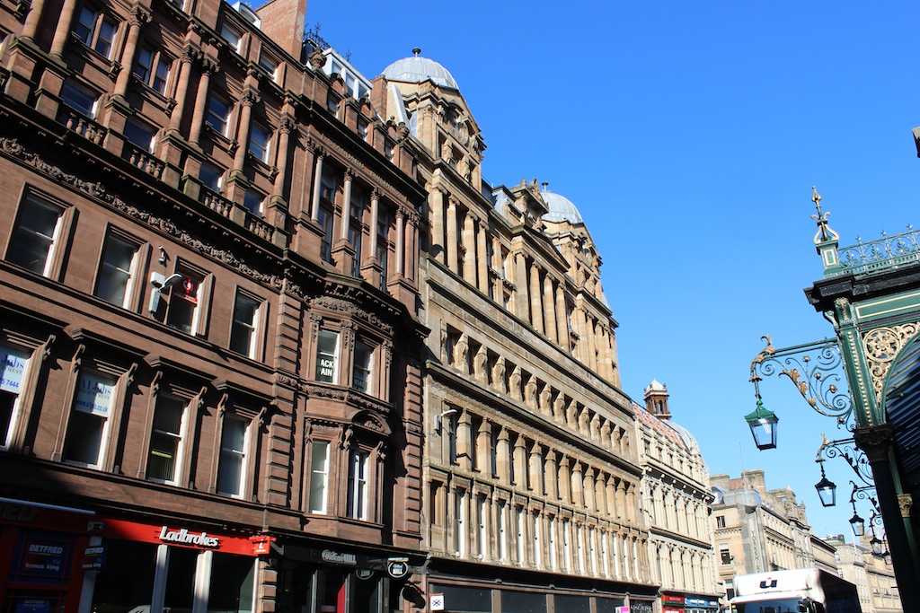
Located directly opposite the main entrance to Central Station on Gordon Street, Grosvenor House was designed in 1859, completed in 1860, ravaged by fire and then re-constructed to the original design in 1864. The building was designed and constructed during the time in which Thomson was in partnership with his brother George, practicing under the name A&G Thomson. It represents both their first full foray into warehouse architecture as well as into speculative development, although as described by Gomme it was “a liability to them all their lives”.
Thomson and his brother were both devoted members of the United Presbyterian Church, their first completed building together was the Caledonia Road UP Church, the congregation of which Thomson remained a member of until his death. The Grosvenor Building stands on the site of the former Gordon Street UP Church, which A&G purchased in order to build their showpiece warehouse, conveniently the money raised by the sale was then used to fund the construction of the St Vincent Street UP Church also designed by A&G Thomson.

The lower four storeys of this building represent Thomson’s original design, which effectively lined in with the head of the building to its right (an elevation approx halfway down this page perhaps makes it clearer). However, the desire for office space in the city, the buildings prominent location and the increasing scale of the surrounding buildings meant the James Hoey Craigie was enlisted to add an extra two storeys of floor space to the building, which he opted to whack a big temple front on and a couple of baroque cupolas for good measure!
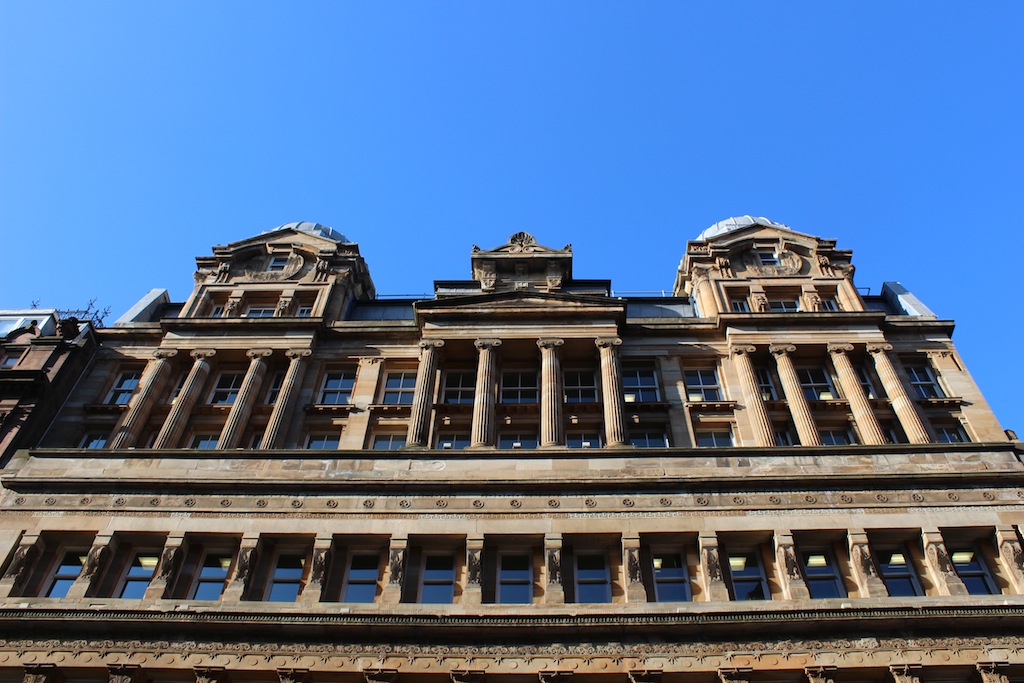
Craigie’s extension is not typically looked upon favourably, Gomme described it as “grotesque”, however I admire the confidence of Craigie to see a building by an architect held in the highest regard among the profession and think to himself, “that would make a good pedastal!” These days the tendency is to design something as set-back and transparent as possible or to clad it in zinc and try to make it look like a roof, harkening back to the trend of the 70’s and 80’s of sticking a mansard on anything going. Craigie has at least delivered a design of quality, even although the overall composition of the two schemes combined is not overly coherent. A final floor was added in the 70’s by Richard Seifert, however this has been set back, clad in zinc and is as about as plain as it is possible to design a facade, therefore this bears no further mention.
Craigie’s twinned baroque domes seem the most out of keeping with Thomson’s aesthetic, whereas his ionic portico and the use of the anthemion motif can be more closely associated with Thomson. Perhaps a better composition would have been found by excluding the central protrusion and having twinned ionic porticos in place of the domes with a smaller acroteria placed correctly directly atop the pediment. The columns of the portico line through more convincingly with the pilastrade and consoles below, whilst the lack of a central focal point would have been more in keeping with Thomson’s terrace designs as can be seen at both Great Western Terrace and Moray Place. However, the resulting square proportion would clearly never be as pleasing as Thomson’s rectangular composition, which approaches the Golden Ratio in terms of height to width. Had Craigie’s design been constructed at ground level on a site of its own (it would have been at home in the Merchant City in the company of buildings like Adam’s earlier Trades Hall) I’m sure it would have received considerably greater admiration as an individual piece of work. It is interesting to note that Craigie was at one point a recipient of the Alexander Thomson scholarship, which allowed him to travel in Italy and develop his knowledge of the baroque.
Anyway, enough of the postulation and on to the building we have! The ground floor is currently of almost no articulation whatsoever, consisting only of shop front windows that are three bays wide. However the current arrangement is not original and archive photographs show that originally there was a central door and two at each of the end bays with acroteria and a fan light above, whilst mullions divided the glazing so that each window was one bay wide.

From first to third floor we get to see the building as Thomson intended. Constructed in ashlar and 15 bays wide, a giant order pilastrade spans between the first and second floors. At first floor level the windows are aediculed, their frieze’s incised with a repeating pattern of anthemions that is also present in the short podium between the bays, which are surmounted by an embossed anthemion. In the surround Thomson utilises his familiar square zig-zag pattern, whilst incised anthemions are also present at the corbel below the dentil moulding.

An elongated squared zig-zag pattern also runs as a dado band behind the window heads, above which lies an intriguing little detail where the half of an anthemion is incised into the pilaster whilst the opposing fronds are carved into acroters that mark the edge of the cornice. An almost imperceptible line of antefixae run across the centre of the punctured cornice, they are engraved with a cross, the rounded head of which almost makes it look like an Egyptian ankh. The two end bays have blind aedicules, these strike me as a bit out of place as they reduce the framing effect of the pilastrade, however it could equally be argued that they serve to add a vertical emphasis to the facade alongside the decreasing story heights and ornamentation as the building rises.

At the second floor the pilasters terminate in an order that I find tough to accurately identify, it is certainly unique to Thomson in a Glaswegian context. It is probably closest to a stylised and squared corinthian capital, where acanthus leaves form a base from which anthemions wrap around the corners. A row of discs forms the base of the entablature, above which runs a frieze of alternating anthemions and lotus flowers, finished with a heavily projecting cornice carved with a continuous pattern of anthemions.
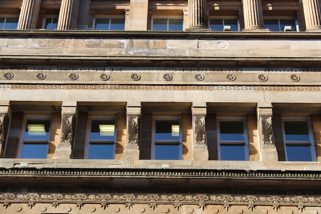
What would have originally been the top floor contains an eaves gallery of significantly and intentionally shorter height. The windows are divided by sculpted and scrolled consoles, however the netting that is currently protecting them makes their detail hard to discern but the central design appears to be of a star or an open flower. Above the entablature is the most simple of all with the re-introduction of the square zig-zag pattern, a frieze of stars (according to Historic Scotland’s listing, although I actually think they are flowers based on the raised nub in the centre of each one) within discs and concluding with a simple alternating pattern of incisions and plugs.
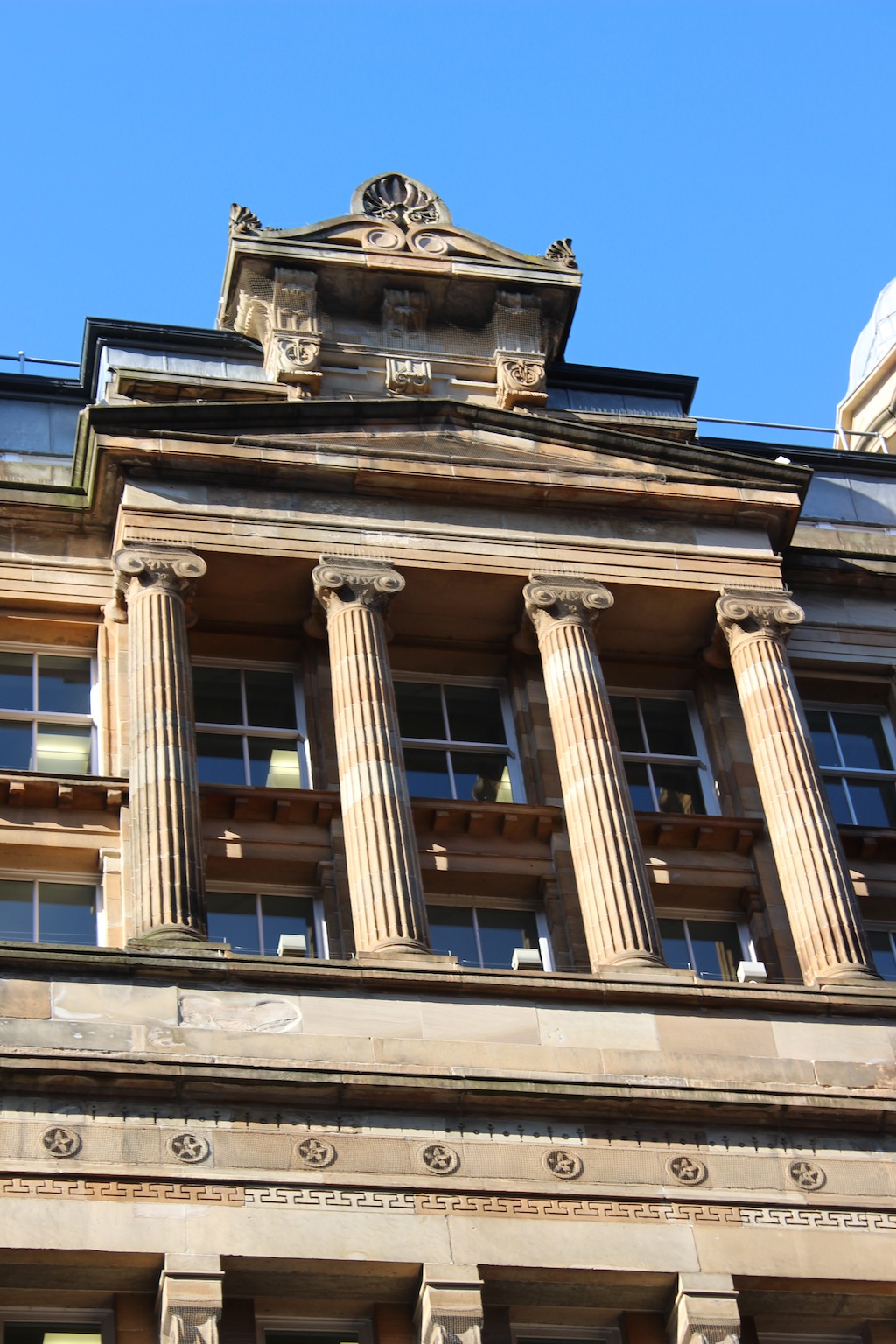
The fourth and fifth floors are home to Craigie’s addition, in which he takes the same windows from Thomson’s second floor, whilst referencing the original building it does undermine the verticality created by Thomson’s progressive reduction of story heights and ornament. However, Craigie does move to generate this elsewhere by introducing three tetrastyle (four-column) ionic porticos, the central one is brought forward and pedimented whilst the outer two are more closely grouped creating the impression of the building stretching upwards.

Above the simple entablature of the outer porticos are Craigie’s cupolas. Building upwards the three window bats are separated by sculpted console brackets and surrounded by a heavy frame. Partially fluted corinthian columns at the corners support a mini-entablature that runs into the side of console brackets, these support a pediment broken by a small attic window set within a heavily sculpted surround. Pediments on all four sides of the tower lead skyward where the cupolas emerges, surmounted by a round-headed pinnacle with a base that appears to be shaped like an ionic capital (as dubiously determined from a low-res archive picture). Centrally, a pediment without ornament sits atop the entablature, whilst behind it the attic window is within an aedicule where sculpted brackets support a cornice adorned with half-anthemion acroters and the final and largest anthemion above scrolls.
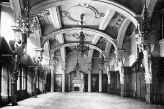
The fires and changes in use that have occurred in this building over the years have sadly meant that there are no remnants of the original interior, or the spectacular baroque interior of the Grovesnor Restaurant that opened in 1899 and is the root of the buildings current name. The opulent interior contained ornate plaster and wood linings, a marble staircase, stained glass, chandeliers and perhaps most impressively beautifully sculpted caryatids designed by Albert Hodge (of Clyde Navigation Trust big coo fame!) that supported arches. The quality of the original restaurant interior was described in the Herald at the time of it’s renovation in the fifties “the old restaurant with its marble pillars and curlicues did not merely belong to Glasgow, it was a period piece of which all Britain could be proud. Its loss is severe.”
However, the facade is still in good condition and is a very important design in the development of Thomson’s warehouse style in particular. It is a seriously under-appreciated building considering its prominent location, when the elements of the facade are considered as separate entities they can each be admired for their architectural merits, and when considered as a whole they are a unique clash of styles that are bound to divide opinion and inspire debate. I admire the Thomson facade hugely but also the confidence of Craigie in his own abilities and style, whilst showing respect for the work of Thomson in trying to incorporate elements of his style without venturing towards pastiche. The placement of this building makes it very easy to stop and appreciate, and I highly recommend you do!
The Historic Scotland listing for this building can be found here.

Fascinating – I had no idea that was a Thomson building, and have never really looked at it properly. Now I will! I don’t know all the architectural terms but can follow the general picture if not all the details.
LikeLiked by 1 person
Great stuff (and oh so sunny too)
LikeLike